

The Gabriela Maskrey Interview

When and where were you born? What was your childhood like? When did you first begin to fall in love with music and art?
I am Peruvian/British - born in London, and raised in Lima. It was very groovy. My father from England moved to Peru for work but, also because he liked hiking and adventure in general. My mom on the other hand is from a town in the jungle called Tarapoto, so my childhood was very outdoorsy and humble. We traveled a lot and did many trips living different and ultimately experiencing contrasting realities. My dad is a music aficionado so I guess it all started right there. Apparently when my mother was pregnant with me they went to see Gregory Isaacs live in London which I still love to this day. Art came more from my grandmother mostly, who enjoyed painting so she was the first person to introduce me to this craft. I guess it is all a combination of elements. Due to all the traveling my house was full of Latin American and African art. We also lived in an adobe home in Lima so this whole primal aesthetic around me definitely made an impact on my life. The music also contributed to add a vibe to the whole thing!
Do you have any siblings? What would you and your friends do for fun growing up? Who were some of your earliest influences in your more formative years? When and where did you see your very first concert?
I have 4 younger brothers. I am the oldest and the only girl too. Go to the beach mainly! Lima is like a big surf town so everything revolves around it. Definitely Matisse, we had many posters of him in the house and the one I remember the most was the ‘Red Interior, Still Life on a Blue Table’. And Guayasamin too, who is an Ecuadorian artist. Apart from this, I think the strongest influence were the wooden masks or other primitive art my parents would collect from different places. Very funny and totally worth owning up to this, but my first concert was probably Bim Sherman when he came to Peru (invited by my father) when I was 9 years old.

When did you realize you wanted to spend your life pursuing music and all things creative? What initially inspired you to become a graphic designer and artist?
After school I felt that the right path for me was the creative one. At this point I had not considered painting, or even knew about graphic design so I pursued Architecture which I studied in Edinburgh. Then the rest fell into place. I learned about graphic design when I first saw an architectural book on Renzo Piano. I was impressed by the format and the paper selection, so I went on to pursue this fully. The artist thing came out of nowhere. I was painting at home one day just doodling in large format and a friend liked it and pushed me to do a show, and I did.
You’ve worked with some phenomenal people including W.I.T.C.H. What has been the most rewarding project, or projects to work on and why? What elements do you pull from that inspire you the most and why?
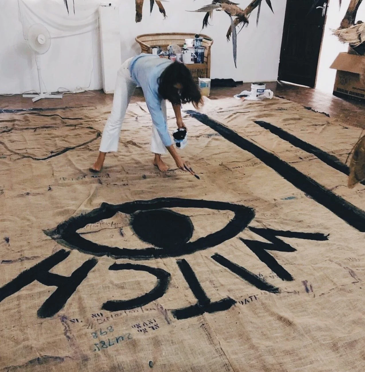
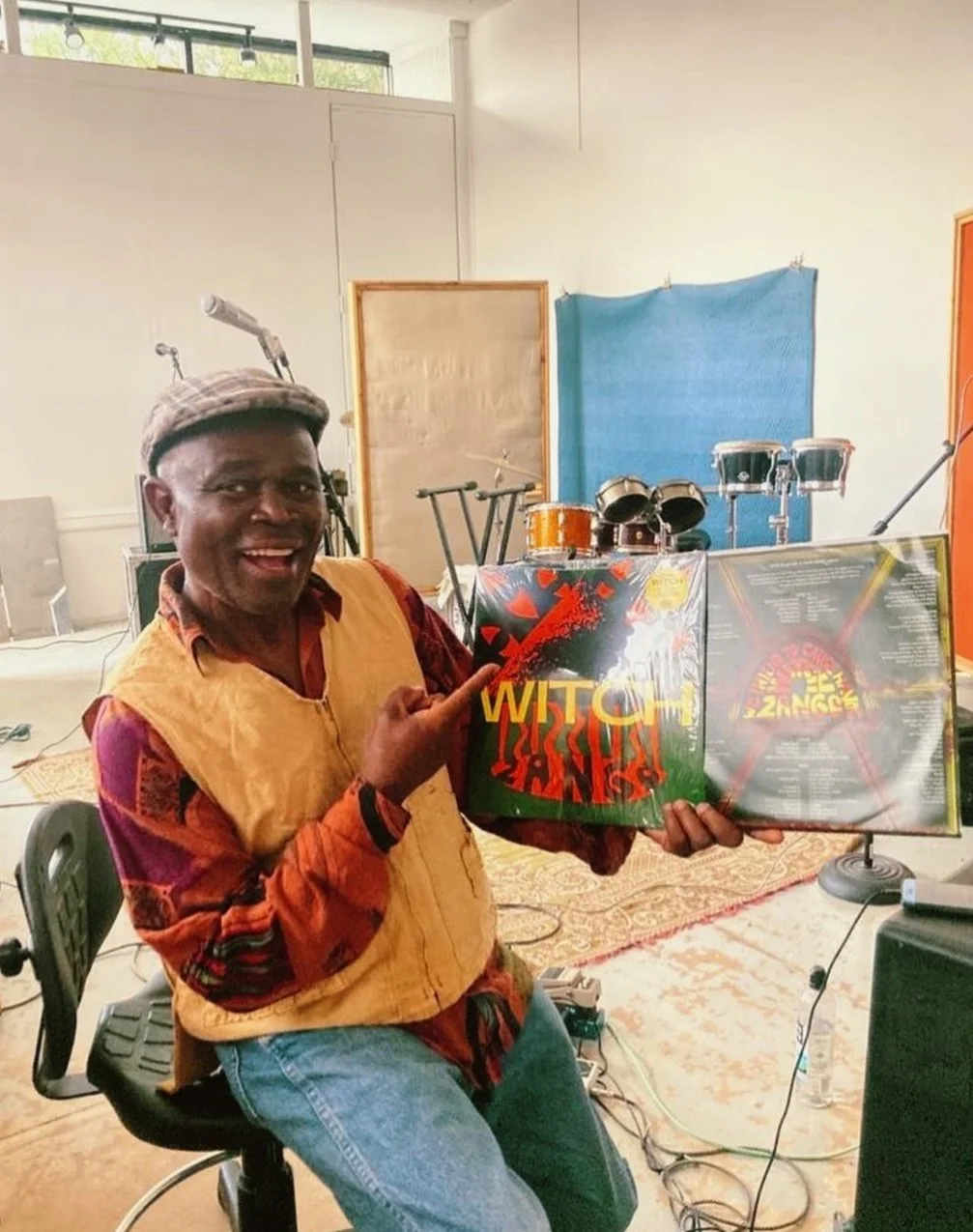
The most challenging project was definitely designing the album cover for Zango. It was the band’s first album in over 40 years and the pressure was high. We had to design something epic and contemporary, but that would also honor the band’s background and history. It was long, I even cried, but we did it. Jagari sent me a lot of voicemail messages of encouragement from Lusaka! Another epic project which lasted for almost two years, was the design of Matacuy a botanical elixir from the Andes. The result of the label is amazing, and has worked wonders in presenting a Peruvian product with a timeless aesthetic to the international market. Matacuy has been published extensively, and is the studio’s most recognizable project as of now. My inspiration is mainly drawn from original designs like old books, advertisements or vintage traveling brochures. I always enjoy looking for those primal forms of expression, design, and branding. I find their vocabulary genuine, and less manipulative than contemporary designs. This constant pursuit to sell is definitely not my jam. Since I surf too, this DIY aesthetic is also definitely my vibe.
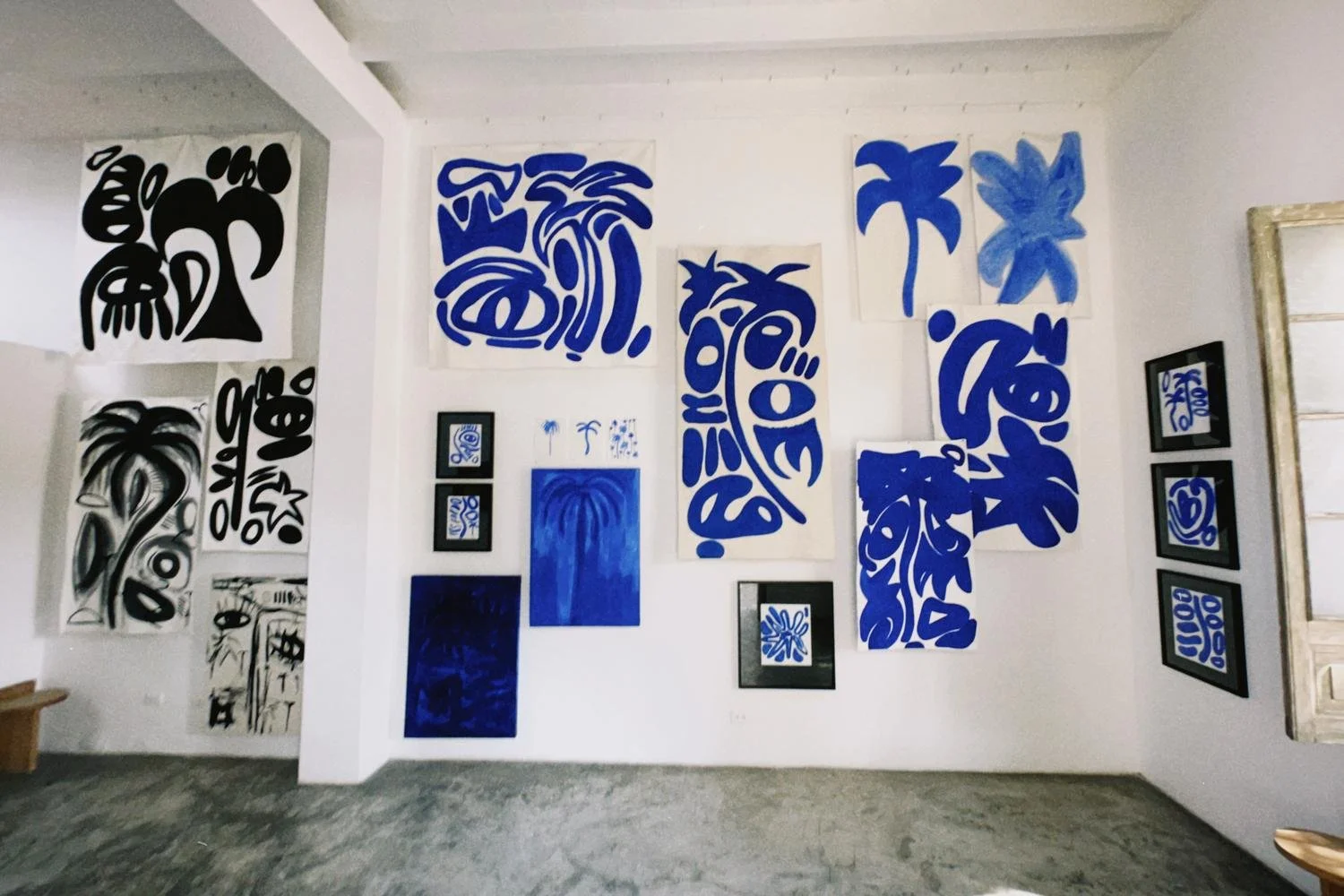
Tell me about your studio Te MATA. Your signature typography style is well known across the world. When did you officially begin to dial your in style?
The studio was born after a trip to New Zealand where I named the studio after a hike to Te Mata Peak. The focus on typography came from an interest in communicating clearly what the project or product is about. It’s a very architectural approach in a way. I am looking for funcion, standing back as a designer to make the product recognizable for what it is and not for what I am adding on it. At first I was very minimalist but then with more surf and more Zamrock, Helvetica flew away from my life and I said hello to more interesting and multidimensional design references. I love humble approaches to design, using less and more bold elements, and definitely developing strong bonds with clients to create truly unique graphics.
Is there anything else you would like to further share with the readers?
Listen to Zango, go to Africa, go to Peru, go surf, read a book, open a cold beer, drop your mobile phone and learn to enjoy life with nothing, but a smile.